Sector Strength
Please note that this should still be considered a work in progress or a beta version. If you find any bugs or have any suggestions, please don't hesitate to contact me.
If you want to learn how to build this yourself, check out my free guide:
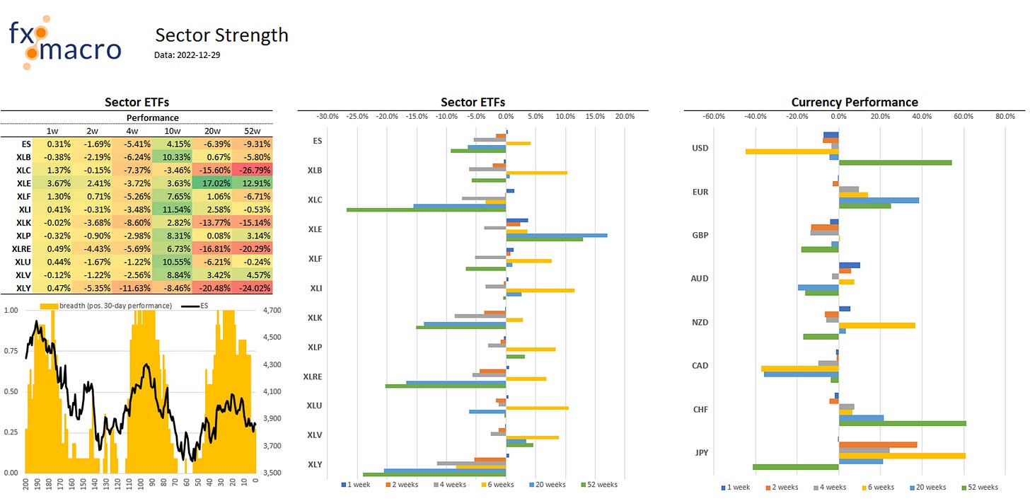
Sector Strength is one of the tools I use to get a quick update on what sectors and currencies performed over different time horizons. Here's what it looks like:
It's pretty intuitive and easy to understand.
The table on the left contains the performance of each of the different ETFs over a different timeframe. The chart below shows the last 200 daily closes of the ES as a black line and how many of the sector ETFs had a positive 30-day performance at that time in relative terms.
The chart in the middle displays sector performance graphically, and the chart on the right shows currency performance.


