

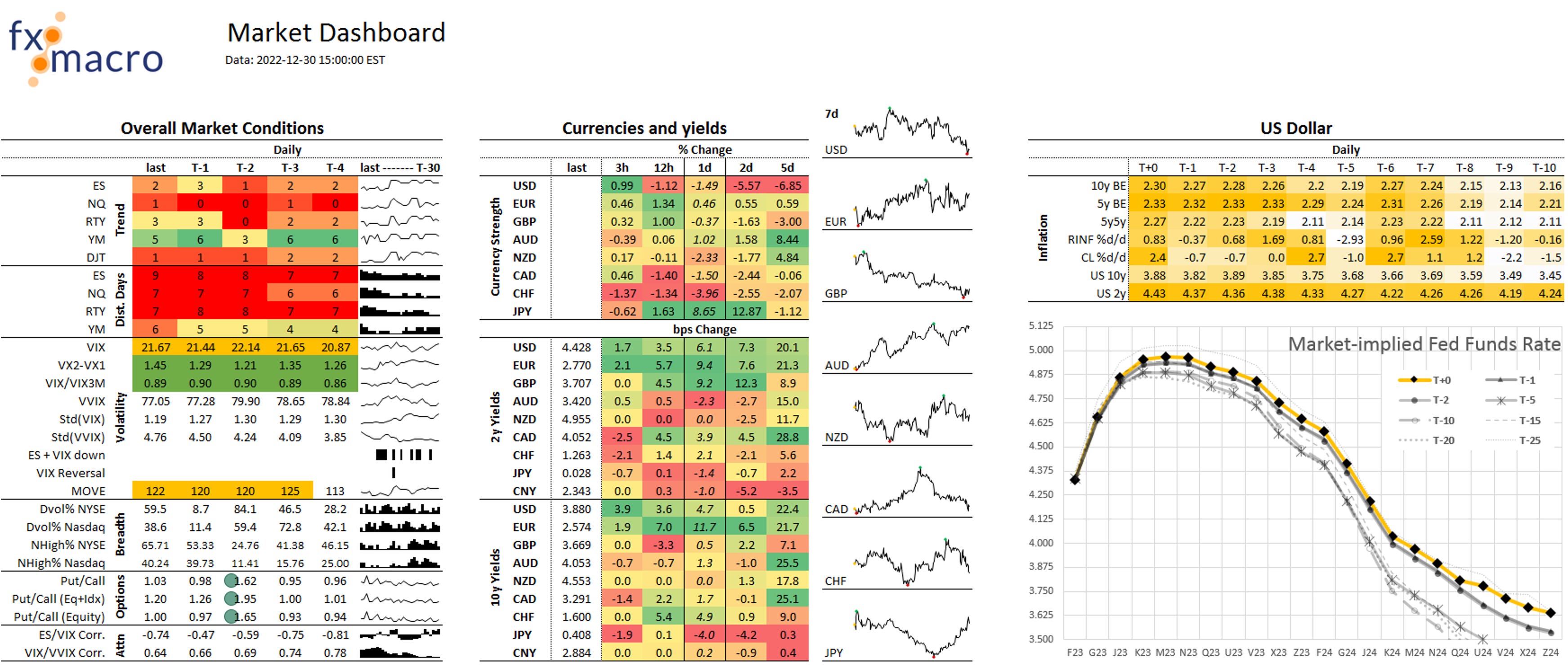
Market Dashboard
Please note that this should still be considered a work in progress or a beta version. If you find any bugs or have any suggestions, please don't hesitate to contact me.
The Market Dashboard is one of the tools I use to get a quick update on the overall market situation. Here's what it looks like:
Let's go through the sections.
Overall Market Conditions
The newest data (based on yesterday's close) is in the column labelled “last”. T-1 means one day before, T-2 two days before, you get the idea.
The sparkline graph on the right shows the data from yesterday to 30 days before that with the latest data on the left. That's different from a stock chart where the latest data is added to the right but it's consistent with how the columns are laid out.

Trend
We're looking at five stock indexes: the S&P 500, the Nasdaq, the Russell 2000, the Dow Jones Industrial and the Dow Jones Transporation Averages.
Each future/index is graded on a simple scoring system with one point for each:
Close is above EMA(100),EMA(100) is rising,Close is above SMA(50),SMA(50) is rising,Close is above EMA(34),Close is above EMA(8), andHull Moving Average is rising.
This gives each index a score of 0-7 points, and since it's based on different kinds of moving averages it comes with the same drawbacks: sideways markets will lead to relatively wild swings in the scores.
Distribution Days
This counts the number of days with the following conditions in the previous 25 trading days:
A close that is at least 0.2% lower than the close of the day, and
Volume is higher than on the day before
The idea comes from IBD, and the higher the number the worse.
Volatility
This section contains a few volatility metrics:
VIX is pretty self-explanatory. Everything above 20 will have a yellow background.
VX2-VX1 is the front end of the VIX term structure. Values above 1 will be green, values between 0 and 1 will be yellow, and if the first two contracts are inverted (i.e. a value below 0) it will be red.
VIX/VIX3M is a similar measure that puts 30-day implied volatility in relation to 3-month IV. Below 1 is green, above 1 is red.
VVIX can be a sign of exhaustion: if it is above 120 it will be highlighted.
Std(VIX) and Std(VVIX) are the standard deviations of VIX and VVIX over 20 days. If the standard deviation of VIX is <0.86 and that of VVIX is <3.16 it can be a sign of a topping market. For more details check out this paper: link
ES + VIX down will be highlighted when both the ES and VIX are lower for the day. This can be a signal that a correction has ended.
VIX Reversal will be highlighted if the daily high of VIX is >20 and it closed more than 3 points below its high. This can be a signal that a correction has ended.
MOVE will be highlighted if MOVE is above 120.
Breadth
Dvol% NYSE and Dvol% Nasdaq are the down volume divided by the sum of up volume and down volume (I'm leaving out the volume of unchanged issues). If this is >90 (or better: >95) it is a sign of panic and can signal the end of a correction.
NHigh% NYSE and NHigh% Nasdaq are the number of new highs divided by the sum of new highs and new lows. If these values are below 1 it is a sign of panic and can signal the end of a correction.
Options
Put/Call ratios can signal panic and the end of a correction when they spike higher. Their usefulness has diminished recently but I'm still keeping track of them.
Attention
ES/VIX Correlation and VIX/VVIX Correlation can both be early warning indicators of market tops. The threshold for ES/VIX is >0.7, and for VIX/VVIX it is <0.2.
Currencies and Yields
This is mostly self-explanatory but here are a few words on how I look at currencies to help you understand things a bit better:
Currencies don't have an absolute price but are always measured in relation to another currency. USD itself doesn't have a price unless it is quoted in a different currency, say EUR or CHF. That means that in order to say something about how strong or weak the dollar (or any other currency) is, we have to compare it to its peers.
To do that, we multiply all USD pairs with each other such that USD is always the numerator. This is what it looks like:
This will give us a (pretty arbitrary) absolute number that we can use as an index: if it's rising the currency is getting stronger, and if it's falling the currency is getting weaker.
That index and its changes are what you see in the Currency Strength section and in the charts on the right here (charted over the last seven days):

It's also why the first column ("last") in the Currency Strength section doesn't have a value in it: it's meaningless.
The sections on 2y and 10y yields don't need much further explanation.
Currencies and Yields
The final section in the Market Dashboard concerns the US dollar. On the top, you will see the daily closes or daily changes for different potential drivers of the dollar.
The chart below shows the market-implied path of the Fed Funds Rate (via ZQ futures) and how that has evolved over the last weeks. The x-axis shows the respective futures expiration.
