Hi there! It's already Sunday again, so it's time for another edition of fx:macro Lite! Great to have you here!
Today's cover image is a psychedelic oil well because of what I wrote in the section on Macro below and because CL is going to be a good example for our practical section on the term structure.
Let's get started…
In case you missed the usual deep-dive yesterday, you can still sign up for that here and get access to the premium content:
💎 Macro and view on the US dollar
A few things that stand out to me:
Growth will be lower from here on while inflation is still elevated. 5y5y forward inflation expectations and breakevens are even rising, and CL has been going up by almost 50% in three months. Slower growth plus high(er) inflation isn't bullish for risk assets.
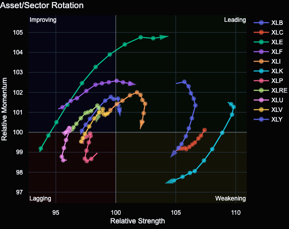
Speaking of energy… XLE 0.00%↑ and crude oil outperformance suggest we're (once again) at the top of the business cycle when nothing performs but energy. The sector rotation chart shows it pretty well. The last time it looked like this was in the first half of 2022 when everything else sold off.
Seasonality is bullish into year-end, and I'm reading three posts per day on that on Twitter or Substack. I'm not sure what the catalyst for risk-on into the end of the year could be. Last year, it was the AI bubble but that horse is dead now. “October” by itself isn't a good catalyst, in my opinion. But I do know that betting against Q4 is often a bad idea.
The following table sums up bullish and bearish points for the overall macro environment and the US dollar. The premium edition of fx:macro contains these summaries for every G8 currency. You can check it out in the Archive for previous editions:
If you want access to that, you can sign up here:
💡 The final part of our primer on the term structure
In the previous two issues of this newsletter, we looked at the futures term structure, what it is, how we can quantify it and how it can be useful in trading. This week, we’ll look at the practical aspects: how to trade with it.
If you haven’t read the first two parts, check them out here:
🔨 A few practical examples
I’ve already mentioned CL and how we can use the two closest expirations as one way to visualize the term structure in TradingView: CL1!-CL2!, i.e. the difference between the front month contract and the one that comes after that - a.k.a. “front-month contango”. (At least that’s what I call it because it sounds nicer than its technical name: reverse calendar spread.)
The following chart shows what it looks like. We’re interested in finding a divergence between what price is doing and what the term structure is telling us. And there are plenty of divergences… I’ve marked four but you can find more:
May 2022: CL is rallying to a new high but front-month contango is telling a different story. Price making a new high while CL1-CL2 is falling isn’t a bullish sign: time to find a short.
August 2022: Same thing: CL makes a new high but the term structure barely moves, again time to look for a short.
November 2022: CL hits resistance from below while CL1-CL2 is making a lower high: expecting the resistance to hold.
January 2023: Higher high for CL but falling front-month contango: looking to sell that high.
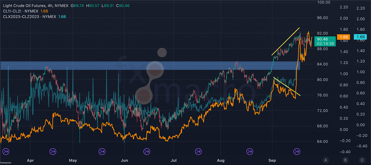
As with everything in trading, it’s not perfect, see next chart. Over a two to three-week period at the start of the month, we’ve had CL breaking through a resistance level while our term structure indicator signalled underlying weakness. The divergence resolved quickly over two days as the term structure went deeper into backwardation again and CL1-CL2 shot up:
📝 Pay attention when dealing with futures data
One thing TradingView isn’t very good at is handling futures data. Note the little circled arrows at the bottom of the chart. They tell you when a continuous futures contract rolls over from one contract to the next. If you click on one, it will tell you what the old and the current front-month contracts are. In this case, we switched vom V23 to X23:
Whenever things look strange (e.g. an unexplained gap or a sharp move), it makes sense to exclude a data artefact because of a futures roll. That’s why I included the spread between X23 and Z23 contracts on the chart above as well. They show pretty much the same divergence albeit a bit flatter. In any case, we would have been on the wrong track to expect a false breakout based on the action in the term structure. Shit happens.
The basic idea is the same across most futures if they have a normal term structure. If they have seasonal one like NG, we have to take a slightly different approach:
The highest point in each of the seasonal cycles is marked by the January contract. So, we could use the next two January contracts, 24F and 25F, and look at their spread:
That does a pretty nice job, there’s a nice divergence in April/May and one that’s currently ongoing. An alternative would be to look at the current V23 contract and its V24 counterpart.
Be careful when you’re using TradingView and you’re dealing with anything that’s not traded on the CME because TradingView only has non-adjusted continuous contracts for most of these futures, and they have nasty roll gaps in them.
🎬 A few more notes
If you’re using Interactive Brokers, they have a nice tool in their Trader Workstation that allows you to explore the term structure in a bit of an interactive way and compare what it looked like on different days in the past. Of course, they have hidden it well but you can find it under “More Advanced Tools > Futures Term Structure”:
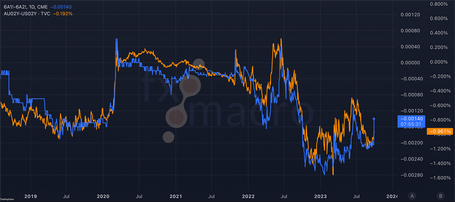
One last thing: the term structure in financial futures is closely tied to interest rates. You can see this in the next chart where the blue line is our front-month contango of 6A (Australian dollar) and the orange line is the difference in 2-year yields between Australia and the US:
They aren’t 100% identical because the time to expiration constantly changes for the futures and the 2y yield is just a very crude proxy for interest rates here in general but you get the idea.
So, this brings our little series on the term structure to a close. I hope you found something useful in it. Feel free to leave a comment and let me know what you think…
🧠 Here's something interesting
This is from an older tweet but it’s still worth keeping in mind, especially when markets are going through a phase like right now:
PART of the reason '08 analogs look so compelling is the default setting on charts. All you see is the downside in the frame. Keep in mind this was the case for 2011 and 2015-2016 as well. Our minds naturally gravitate to what is available on the screen.


![[FREE] fx:macro Lite / 17.09.23](https://substackcdn.com/image/fetch/$s_!vHR2!,w_140,h_140,c_fill,f_auto,q_auto:good,fl_progressive:steep,g_auto/https%3A%2F%2Fsubstack-post-media.s3.amazonaws.com%2Fpublic%2Fimages%2Ff783421b-2902-40a4-9919-85fcdaeef77c_1024x1024.png)
![[FREE] fx:macro Lite / 24.09.23](https://substackcdn.com/image/fetch/$s_!LiMk!,w_140,h_140,c_fill,f_auto,q_auto:good,fl_progressive:steep,g_auto/https%3A%2F%2Fsubstack-post-media.s3.amazonaws.com%2Fpublic%2Fimages%2Fe214f792-1092-49a7-a004-5175e12714f6_1024x1024.png)


Great coverage, thank you, appreciate!
Complementary, especially on seasonality and other angles focused on the S&P 500.
https://maverickequityresearch.substack.com/p/the-s-and-p-500-report-performance-51a
Have a great weekend!